
For a period of several months, I had the pleasure of creating and designing a new matcha project called “Ivi Matcha“.
The creation of this matcha brand presented an opportunity to develop a simple identity, from the initial strategy to its execution.
I am grateful for the opportunity to influence every part of the brand, from deciding its main aims and values to creating a visual style that matches its beliefs.
The objective of establishing a brand that feels intentional, timeless, and deeply connected to the ritual of enjoying matcha was the driving force behind every stage of the process.
Ivi Matcha recently held a “Matcha & Petale” workshop at Double Coffee in Bucharest, marking “the debutant step” in the company’s growth and expansion.
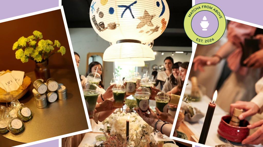
Ivi Matcha has joined forces with Petale Station to bring together a group of lovely women who are looking for a change from their usual weekend routines and who are excited about expressing themselves through creativity.
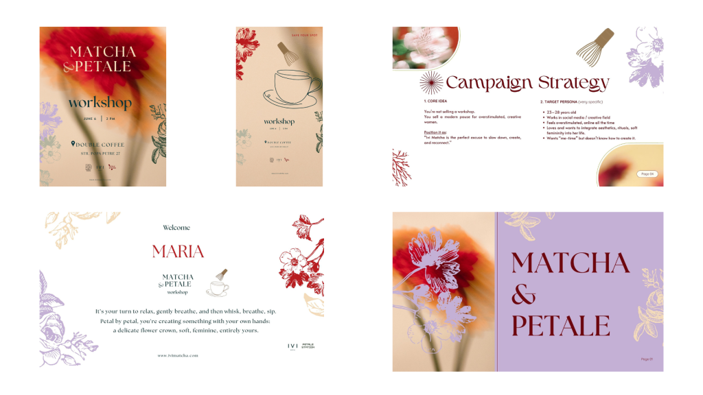
What can I tell you about this unique project, is that I have learned a lot, and I had the chance to improve my graphic design area, because it’s all about progress, not perfection.
It feels good to put in practice ideas that came from a lot of research.
I also appreciate and feel inspired by a couple of brands coming from the outside: Kitsune, Rocky & Matcha, Nekohama, or Blank Street.
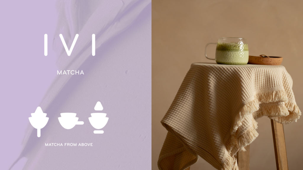
The visual identity is centered around a minimal logo that captures the brand’s essence through simplicity.
The mark is constructed from three symbolic elements: a leaf representing nature and the origin of matcha, a cup representing the ritual of drinking, and a holder that grounds the composition.
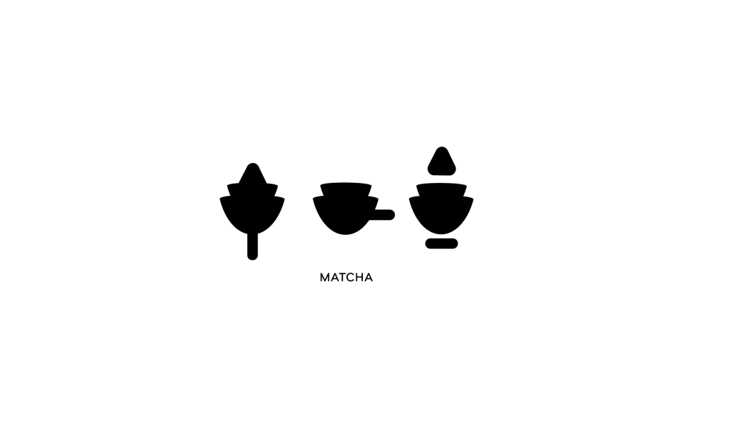
The matcha ceremony is incomplete without the chasen, a tool that appears to levitate above the cup. At the same time the symbol emphasizes a “matcha drop” coming from above. The bell tail transforms into a leaf which then becomes the cup’s handle, and finally the countertop on which we serve the drink.
The ivy leaf reminds us of adaptability and evolution, as well the plant’s capacity to “never stop growing”, while the matcha leaf invites us to remain grounded in peace.
The visual identity is centered around a minimal logo that captures the brand’s essence through simplicity.
Named after the climbing evergreen plant, but written differently, ivy represents fidelity, eternity, and God’s gift.
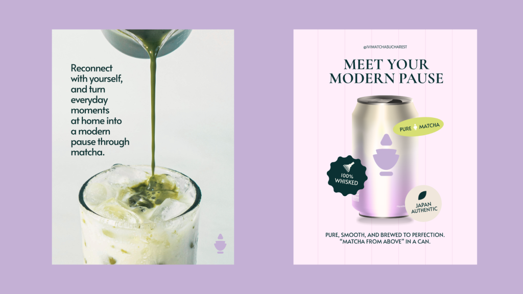
The motto “Matcha from Above” reminds us that nourishment is both physical and spiritual. “From Above” embodies a calming ritual that surpasses the noise of everyday life, but at the same time encourages consumers to pause and reconnect with themselves so they can start their day with clarity.
This project has been another stepping stone in my journey, and I’m grateful for bringing this matcha brand to life for Ana Maria Pentelei.
From shaping its brand strategy, storytelling, and identity, every decision was made with intention to create a brand that feels calm, and memorable.
Ivi Matcha’s products will be soon available to savor and share with others: www.ivimatcha.com
PS: I have learned that the faster you accept your mistakes and take action to fix them, the more confident you become for the next step. In a sense, you are always in the “beginner phase”. Don’t worry about being perfect, just get it done, as Dr. Thomas Juli would say to me. You get what I mean.
From start to finish, the credit belongs to God. It’s an answered prayer.
I’m far from being an example, but I feel grateful for what He is doing for me, but also through me.
Best regards,
Mijournali